通过 clip-path 绘制各种图形
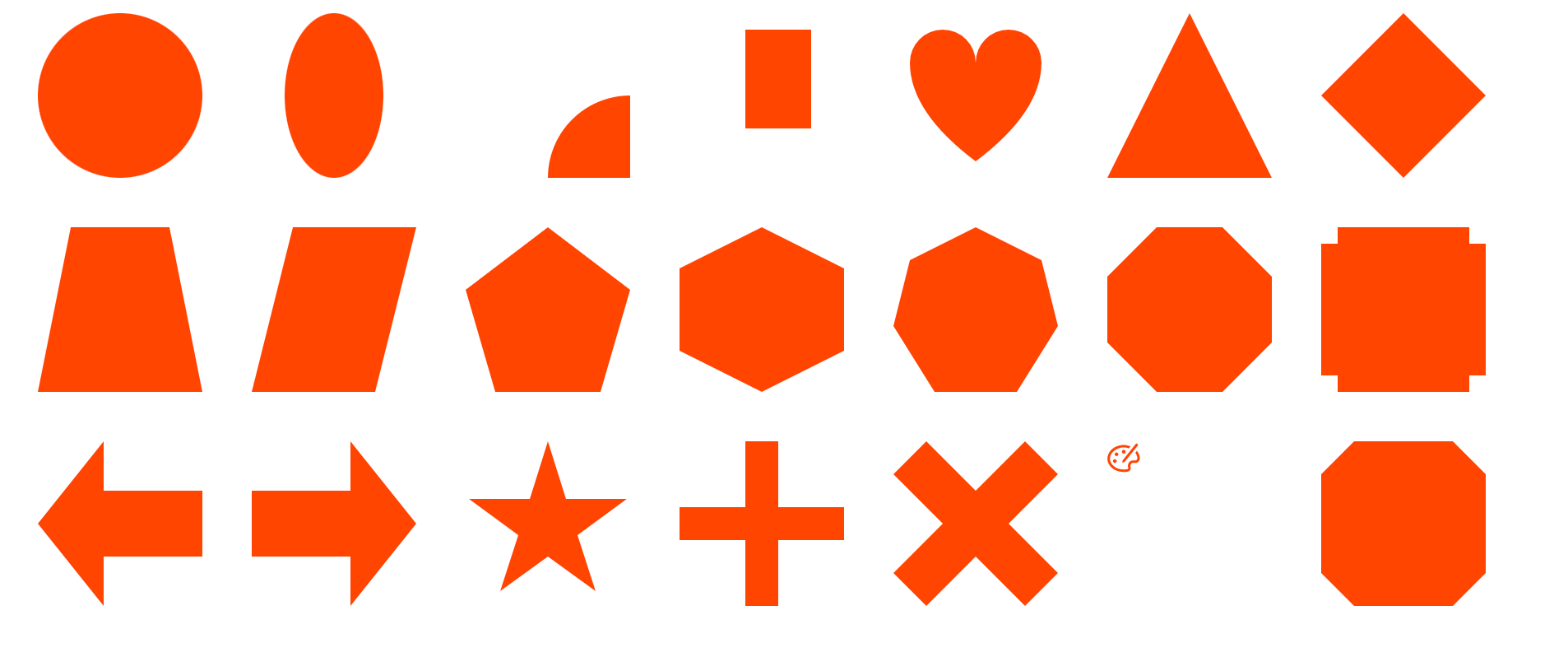
我们以前通过 border 那一套方案可以实现用 CSS 画出简单的图形(如:三角形、梯形、棱形等),但是受制于 border 属性的局限性,过于复杂的图形则无法通过 border 来实现。但是 clip-path 则不一样,不仅可以通过 circle()、ellipse()、inset() 函数实现简单的图形,还可以通过 polygon() 和 path() 函数实现复杂的图形,甚至可以引用 SVG 的 <clipPath> 属性来实现更复杂的裁剪功能。
CSS 的 clip-path 属性使用裁剪方式创建元素的可显示区域。区域内的部分显示,区域外的隐藏。
基本图形
- 圆形效果(circle())
.circle {
    /* (radius at x y) */
    clip-path: circle(50% at 50% 50%);
}
- 椭圆形(ellipse())
.ellipse {
    /* (w h at x y) */
    clip-path: ellipse(30% 50% at 50% 50%);
}
- 扇形
.sector {
    clip-path: circle(50% at 100% 100%);
}
- 矩形裁剪(inset())
.inset {
    /* (top right bottom left) */
    clip-path: inset(10% 20% 30% 40%);
}
多边形(polygon)
- 三角形
.triangle {
    clip-path: polygon(50% 0, 100% 100%, 0 100%);
}
- 棱形
.prismatic-shape {
    clip-path: polygon(50% 0, 100% 50%, 50% 100%, 0 50%);
}
- 梯形
.trapezoid {
    clip-path: polygon(20% 0, 80% 0, 100% 100%, 0 100%);
}
- 平行四边形
.parallelogram {
    clip-path: polygon(25% 0, 100% 0, 75% 100%, 0 100%);
}
- 五边形
.pentagon {
    clip-path: polygon(50% 0%, 100% 38%, 82% 100%, 18% 100%, 0% 38%);
}
- 六边形
.hexagon {
    clip-path: polygon(50% 0, 100% 25%, 100% 75%, 50% 100%, 0 75%, 0 25%);
}
- 七边形
.heptagon {
    clip-path: polygon(50% 0%, 90% 20%, 100% 60%, 75% 100%, 25% 100%, 0% 60%, 10% 20%);
}
- 八边形
.octagon {
    clip-path: polygon(30% 0%, 70% 0%, 100% 30%, 100% 70%, 70% 100%, 30% 100%, 0% 70%, 0% 30%);
}
特殊图形
- 槽口
.notch {
    clip-path: polygon(10% 0, 90% 0, 90% 10%, 100% 10%, 100% 90%, 90% 90%, 90% 100%, 10% 100%, 10% 90%, 0 90%, 0 10%, 10% 10%);
}
- 左箭头
.left-arrow {
    clip-path: polygon(0 50%, 40% 0, 40% 30%, 100% 30%, 100% 70%, 40% 70%, 40% 100%);
}
- 右箭头
.right-arrow {
    clip-path: polygon(0 30%, 60% 30%, 60% 0, 100% 50%, 60% 100%, 60% 70%, 0 70%);
}
- 五角星
.five-pointed-star {
    clip-path: polygon(50% 0%, 61% 35%, 98% 35%, 68% 57%, 79% 91%, 50% 70%, 21% 91%, 32% 57%, 2% 35%, 39% 35%);
}
- 加号
.plus {
    clip-path: polygon(40% 0, 60% 0, 60% 40%, 100% 40%, 100% 60%, 60% 60%, 60% 100%, 40% 100%, 40% 60%, 0 60%, 0 40%, 40% 40%);
}
- 关闭按钮
.close {
    clip-path: polygon(20% 0%, 0% 20%, 30% 50%, 0% 80%, 20% 100%, 50% 70%, 80% 100%, 100% 80%, 70% 50%, 100% 20%, 80% 0%, 50% 30%);
}
path路径
通过指定 path 路径,我们可以裁剪任意形状的图形。
.path {
    clip-path: path('M10,30 A20,20,0,0,1,50,30 A20,20,0,0,1,90,30 Q90,60,50,90 Q10,60,10,30 Z');
}
SVG
clip-path 除了可以指定 path 外,还可以通过 url(#id) 的方式引用 SVG 的
<style>
    .svg {
        clip-path: url(#clipPathID);
    }
</style>

<svg version="1.1" xmlns="http://www.w3.org/2000/svg" width="0" height="0">
    <defs>
        <clipPath id="clipPathID">
            <path d="M9.95732 2.23333C11.4233 2.23457 12.8609 2.51873 14.173 3.05389L13.143 4.32519C12.2618 4.01761 11.3219 3.83764 10.3608 3.79745L9.94763 3.78882L9.49907 3.79781C8.53051 3.83976 7.57724 4.02841 6.65725 4.36221C5.66538 4.72182 4.77182 5.23108 4.00203 5.87724C3.2481 6.51138 2.65553 7.24102 2.24347 8.04406C1.82614 8.85528 1.61393 9.70826 1.61393 10.5723C1.61393 11.431 1.82467 12.2681 2.23902 13.0591C2.64725 13.8333 3.23586 14.5348 3.98645 15.1423C4.75126 15.7593 5.64612 16.246 6.6442 16.5873C7.68571 16.9445 8.79681 17.1254 9.9453 17.1254C10.4081 17.1254 10.8686 17.0949 11.3263 17.0342L11.7829 16.9635L12.3424 16.8523L12.4003 16.8342C12.4772 16.7999 12.5509 16.7262 12.6067 16.6291C12.6885 16.4854 12.7224 16.3108 12.7047 16.1387L12.6818 16.0106L12.6511 15.9021L12.5942 15.6742C12.3973 14.7598 12.567 13.8154 13.0729 13.0449C13.6184 12.2128 14.4944 11.6932 15.4454 11.6276L15.6503 11.6206H17.126L17.2402 11.613C17.7292 11.5473 18.1334 11.0663 18.2325 10.4628L18.2498 10.3215L18.2555 10.1388L18.2534 10.0672L18.2274 9.83713L18.1767 9.53908C18.0393 8.84688 17.7674 8.17788 17.3655 7.54416C17.2547 7.36867 17.1351 7.19746 17.0068 7.03077L18.0056 5.7969C18.2503 6.08855 18.4734 6.39348 18.6741 6.71071C19.1867 7.51849 19.5329 8.38228 19.7044 9.27682L19.7605 9.61367L19.8022 9.97437L19.8066 10.1743L19.8017 10.3566C19.7205 11.8619 18.6412 13.0669 17.2955 13.1609L17.126 13.1668H15.6526C15.1452 13.1692 14.6685 13.4395 14.3708 13.8932C14.1395 14.2476 14.0364 14.6795 14.0739 15.1046L14.0987 15.2861L14.1734 15.577C14.3441 16.1868 14.2646 16.8522 13.9571 17.3921C13.7119 17.8225 13.3409 18.1393 12.9125 18.2941L12.7492 18.3444L12.1473 18.4676C11.7127 18.5482 11.2766 18.6047 10.8394 18.637L10.402 18.6612L9.94763 18.6693C8.62956 18.6693 7.34823 18.4602 6.14487 18.0483C4.97652 17.648 3.92482 17.0741 3.01607 16.3415C2.09995 15.6012 1.37825 14.7363 0.871783 13.7719C0.339912 12.7567 0.0700684 11.6779 0.0700684 10.5653C0.0700684 9.45066 0.338603 8.36257 0.869678 7.32813C1.37667 6.33962 2.09652 5.44912 3.00991 4.68141C3.9196 3.91754 4.9709 3.31763 6.13871 2.89593C7.08891 2.55695 8.07095 2.34725 9.06289 2.27079L9.48856 2.24619L9.93704 2.23735L9.95732 2.23333ZM4.58441 10.9092C5.21597 10.9092 5.72723 11.4226 5.72937 12.0541C5.72937 12.6857 5.21597 13.1991 4.58441 13.1991C3.9507 13.1991 3.43944 12.6857 3.43944 12.0541C3.43944 11.4226 3.95285 10.9092 4.58441 10.9092ZM17.3744 1.53128C17.5539 1.30683 17.8815 1.27044 18.1059 1.45L18.5123 1.77512C18.7367 1.95467 18.7731 2.28218 18.5936 2.50663L10.5916 12.509L9.40003 13.0359C9.36045 13.0534 9.31641 13.0581 9.27402 13.0494C9.16139 13.0263 9.08882 12.9163 9.11193 12.8036L9.37246 11.5337L17.3744 1.53128ZM5.62529 6.74564C6.25685 6.74564 6.77026 7.25905 6.77026 7.89061C6.77026 8.52217 6.25685 9.03558 5.62529 9.03558C4.99158 9.03558 4.48032 8.52217 4.48032 7.89061C4.48032 7.25905 4.99373 6.74564 5.62529 6.74564ZM9.99699 5.18432C10.6307 5.18432 11.142 5.69773 11.142 6.32929C11.142 6.96085 10.6285 7.47426 9.99699 7.47426C9.36328 7.47426 8.85202 6.96085 8.85202 6.32929C8.85202 5.69773 9.36543 5.18432 9.99699 5.18432Z"/>
        </clipPath>
    </defs>
</svg>
<div class="demo svg"></div>
动画
clip-path属性支持transition动画,但前提是使用相同的裁剪函数以及相同的参数个数。
.animation {
    clip-path: polygon(20% 0%, 80% 0%, 100% 20%, 100% 80%, 80% 100%, 20% 100%, 0% 80%, 0% 20%);
    transition:.5s clip-path;
}
.animation:hover {
    clip-path: polygon(0 0, 0 0, 100% 0, 100% 0, 100% 100%, 100% 100%, 0 100%, 0 100%);
}
将鼠标移动到图形上以查看效果:
兼容性
clip-path 是 CSS3 的特性,所以 IE 就不用想了,但是除了 IE 之外,其他浏览器基本没太大问题。如果项目不考虑兼容 IE 的话,那就放心使用吧。
兼容性报告请戳这里:https://caniuse.com/?search=clip-path
完整示例代码
代码
<!DOCTYPE html>
<html lang="en">
<head>
    <meta charset="UTF-8">
    <meta name="viewport" content="width=device-width, initial-scale=1.0">
    <title>CSS clip-path Example</title>
</head>
<body>
    <div class="container">
        <div class="demo circle"></div>
        <div class="demo ellipse"></div>
        <div class="demo sector"></div>
        <div class="demo inset"></div>
        <div class="demo path"></div>
        <!-- 多边形 -->
        <div class="demo triangle"></div>
        <div class="demo prismatic-shape"></div>
        <div class="demo trapezoid"></div>
        <div class="demo parallelogram"></div>
        <div class="demo pentagon"></div>
        <div class="demo hexagon"></div>
        <div class="demo heptagon"></div>
        <div class="demo octagon"></div>
        <!-- 特殊图形 -->
        <div class="demo notch"></div>
        <div class="demo left-arrow"></div>
        <div class="demo right-arrow"></div>
        <div class="demo five-pointed-star"></div>
        <div class="demo plus"></div>
        <div class="demo close"></div>
        <!-- SVG -->
        <svg version="1.1" xmlns="http://www.w3.org/2000/svg" width="0" height="0">
            <defs>
                <clipPath id="clipPathID">
                    <path d="M9.95732 2.23333C11.4233 2.23457 12.8609 2.51873 14.173 3.05389L13.143 4.32519C12.2618 4.01761 11.3219 3.83764 10.3608 3.79745L9.94763 3.78882L9.49907 3.79781C8.53051 3.83976 7.57724 4.02841 6.65725 4.36221C5.66538 4.72182 4.77182 5.23108 4.00203 5.87724C3.2481 6.51138 2.65553 7.24102 2.24347 8.04406C1.82614 8.85528 1.61393 9.70826 1.61393 10.5723C1.61393 11.431 1.82467 12.2681 2.23902 13.0591C2.64725 13.8333 3.23586 14.5348 3.98645 15.1423C4.75126 15.7593 5.64612 16.246 6.6442 16.5873C7.68571 16.9445 8.79681 17.1254 9.9453 17.1254C10.4081 17.1254 10.8686 17.0949 11.3263 17.0342L11.7829 16.9635L12.3424 16.8523L12.4003 16.8342C12.4772 16.7999 12.5509 16.7262 12.6067 16.6291C12.6885 16.4854 12.7224 16.3108 12.7047 16.1387L12.6818 16.0106L12.6511 15.9021L12.5942 15.6742C12.3973 14.7598 12.567 13.8154 13.0729 13.0449C13.6184 12.2128 14.4944 11.6932 15.4454 11.6276L15.6503 11.6206H17.126L17.2402 11.613C17.7292 11.5473 18.1334 11.0663 18.2325 10.4628L18.2498 10.3215L18.2555 10.1388L18.2534 10.0672L18.2274 9.83713L18.1767 9.53908C18.0393 8.84688 17.7674 8.17788 17.3655 7.54416C17.2547 7.36867 17.1351 7.19746 17.0068 7.03077L18.0056 5.7969C18.2503 6.08855 18.4734 6.39348 18.6741 6.71071C19.1867 7.51849 19.5329 8.38228 19.7044 9.27682L19.7605 9.61367L19.8022 9.97437L19.8066 10.1743L19.8017 10.3566C19.7205 11.8619 18.6412 13.0669 17.2955 13.1609L17.126 13.1668H15.6526C15.1452 13.1692 14.6685 13.4395 14.3708 13.8932C14.1395 14.2476 14.0364 14.6795 14.0739 15.1046L14.0987 15.2861L14.1734 15.577C14.3441 16.1868 14.2646 16.8522 13.9571 17.3921C13.7119 17.8225 13.3409 18.1393 12.9125 18.2941L12.7492 18.3444L12.1473 18.4676C11.7127 18.5482 11.2766 18.6047 10.8394 18.637L10.402 18.6612L9.94763 18.6693C8.62956 18.6693 7.34823 18.4602 6.14487 18.0483C4.97652 17.648 3.92482 17.0741 3.01607 16.3415C2.09995 15.6012 1.37825 14.7363 0.871783 13.7719C0.339912 12.7567 0.0700684 11.6779 0.0700684 10.5653C0.0700684 9.45066 0.338603 8.36257 0.869678 7.32813C1.37667 6.33962 2.09652 5.44912 3.00991 4.68141C3.9196 3.91754 4.9709 3.31763 6.13871 2.89593C7.08891 2.55695 8.07095 2.34725 9.06289 2.27079L9.48856 2.24619L9.93704 2.23735L9.95732 2.23333ZM4.58441 10.9092C5.21597 10.9092 5.72723 11.4226 5.72937 12.0541C5.72937 12.6857 5.21597 13.1991 4.58441 13.1991C3.9507 13.1991 3.43944 12.6857 3.43944 12.0541C3.43944 11.4226 3.95285 10.9092 4.58441 10.9092ZM17.3744 1.53128C17.5539 1.30683 17.8815 1.27044 18.1059 1.45L18.5123 1.77512C18.7367 1.95467 18.7731 2.28218 18.5936 2.50663L10.5916 12.509L9.40003 13.0359C9.36045 13.0534 9.31641 13.0581 9.27402 13.0494C9.16139 13.0263 9.08882 12.9163 9.11193 12.8036L9.37246 11.5337L17.3744 1.53128ZM5.62529 6.74564C6.25685 6.74564 6.77026 7.25905 6.77026 7.89061C6.77026 8.52217 6.25685 9.03558 5.62529 9.03558C4.99158 9.03558 4.48032 8.52217 4.48032 7.89061C4.48032 7.25905 4.99373 6.74564 5.62529 6.74564ZM9.99699 5.18432C10.6307 5.18432 11.142 5.69773 11.142 6.32929C11.142 6.96085 10.6285 7.47426 9.99699 7.47426C9.36328 7.47426 8.85202 6.96085 8.85202 6.32929C8.85202 5.69773 9.36543 5.18432 9.99699 5.18432Z"/>
                </clipPath>
            </defs>
        </svg>
        <div class="demo svg"></div>
        <!-- 动画 -->
        <div class="demo animation"></div>
    </div>
    <style>
        .container {
            width: 100%;
            height: 100%;
            display: flex;
            flex-wrap: wrap;
        }
        .demo {
            width: 100px;
            height: 100px;
            margin: 0 15px 30px;
            background-color: orangered;
        }
        .circle {
            /* (radius at x y) */
            clip-path: circle(50% at 50% 50%);
        }
        .ellipse {
            /* (w h at x y) */
            clip-path: ellipse(30% 50% at 50% 50%);
        }
        .sector {
            clip-path: circle(50% at 100% 100%);
        }
        .inset {
            /* (top right bottom left) */
            clip-path: inset(10% 20% 30% 40%);
        }
        .path {
            clip-path: path('M10,30 A20,20,0,0,1,50,30 A20,20,0,0,1,90,30 Q90,60,50,90 Q10,60,10,30 Z');
        }
        .triangle {
            clip-path: polygon(50% 0, 100% 100%, 0 100%);
        }
        .prismatic-shape {
            clip-path: polygon(50% 0, 100% 50%, 50% 100%, 0 50%);
        }
        .trapezoid {
            clip-path: polygon(20% 0, 80% 0, 100% 100%, 0 100%);
        }
        .parallelogram {
            clip-path: polygon(25% 0, 100% 0, 75% 100%, 0 100%);
        }
        .pentagon {
            clip-path: polygon(50% 0%, 100% 38%, 82% 100%, 18% 100%, 0% 38%);
        }
        .hexagon {
            clip-path: polygon(50% 0, 100% 25%, 100% 75%, 50% 100%, 0 75%, 0 25%);
        }
        .heptagon {
            clip-path: polygon(50% 0%, 90% 20%, 100% 60%, 75% 100%, 25% 100%, 0% 60%, 10% 20%);
        }
        .octagon {
            clip-path: polygon(30% 0%, 70% 0%, 100% 30%, 100% 70%, 70% 100%, 30% 100%, 0% 70%, 0% 30%);
        }
        .notch {
            clip-path: polygon(10% 0, 90% 0, 90% 10%, 100% 10%, 100% 90%, 90% 90%, 90% 100%, 10% 100%, 10% 90%, 0 90%, 0 10%, 10% 10%);
        }
        .left-arrow {
            clip-path: polygon(0 50%, 40% 0, 40% 30%, 100% 30%, 100% 70%, 40% 70%, 40% 100%);
        }
        .right-arrow {
            clip-path: polygon(0 30%, 60% 30%, 60% 0, 100% 50%, 60% 100%, 60% 70%, 0 70%);
        }
        .five-pointed-star {
            clip-path: polygon(50% 0%, 61% 35%, 98% 35%, 68% 57%, 79% 91%, 50% 70%, 21% 91%, 32% 57%, 2% 35%, 39% 35%);
        }
        .plus {
            clip-path: polygon(40% 0, 60% 0, 60% 40%, 100% 40%, 100% 60%, 60% 60%, 60% 100%, 40% 100%, 40% 60%, 0 60%, 0 40%, 40% 40%);
        }
        .close {
            clip-path: polygon(20% 0%, 0% 20%, 30% 50%, 0% 80%, 20% 100%, 50% 70%, 80% 100%, 100% 80%, 70% 50%, 100% 20%, 80% 0%, 50% 30%);
        }
        .svg {
            clip-path: url(#clipPathID);
        }
        .animation {
            clip-path: polygon(20% 0%, 80% 0%, 100% 20%, 100% 80%, 80% 100%, 20% 100%, 0% 80%, 0% 20%);
            /* clip-path: ellipse(50% 50% at 50% 50%); */
            transition:.5s clip-path;
        }
        .animation:hover {
            clip-path: polygon(0 0, 0 0, 100% 0, 100% 0, 100% 100%, 100% 100%, 0 100%, 0 100%);
            /* clip-path: ellipse(20% 40% at 50% 50%); */
        }
    </style>
</body>
</html>