探索 el-table 中 tooltip 功能实现
el-table 中有个当内容超出一行时,会显示尾部省略号并且鼠标放上去会有 tooltip 提示效果的功能,现在我们就来探索一番,看下 el-table 是如何实现该功能的,最后我们再自己尝试仿照实现一个以加深理解。
环境
- Vue 2.7.8
- element-ui 2.15.9
代码分析
寻找入口点
打开 node_modules/element-ui/package/table/index.js
import ElTable from './src/table';

/* istanbul ignore next */
ElTable.install = function(Vue) {
  Vue.component(ElTable.name, ElTable);
};

export default ElTable;
可以清晰看到入口文件指向了 node_modules/element-ui/package/table/src/table.vue,那么此文件则是我们首先要分析的入口文件。
table.vue
打开 table.vue 文件,可以看到定义了大量的 props 和 methods 用于交互操作,但是这些都不是我们的重点,我们的重点是寻找 tooltip 相关的代码。最终定位到如下代码:
<template>
    ...
    <div
      class="el-table__body-wrapper"
      ref="bodyWrapper"
      :class="[layout.scrollX ? `is-scrolling-${scrollPosition}` : 'is-scrolling-none']"
      :style="[bodyHeight]">
      <table-body
        :context="context"
        :store="store"
        :stripe="stripe"
        :row-class-name="rowClassName"
        :row-style="rowStyle"
        :highlight="highlightCurrentRow"
        :style="{
           width: bodyWidth
        }">
      </table-body>
      ...
    </div>
    ...
</template>
table-body.js
虽然 table-body.js 组件中采用了 render 渲染函数 的方式来编写组件,但是这并不影响我们的探索,我们不必深究渲染函数的语法和实现原理,目前能看懂代码即可。
首先看下 render 函数的实现:
  render(h) {
    const data = this.data || [];
    return (
      <table
        class="el-table__body"
        cellspacing="0"
        cellpadding="0"
        border="0">
        <colgroup>
          {
            this.columns.map(column => <col name={column.id} key={column.id} />)
          }
        </colgroup>
        <tbody>
          {
            data.reduce((acc, row) => {
              return acc.concat(this.wrappedRowRender(row, acc.length));
            }, [])
          }
          <el-tooltip effect={this.table.tooltipEffect} placement="top" ref="tooltip" content={this.tooltipContent}></el-tooltip>
        </tbody>
      </table>
    );
  },
el-table 内部维护了一个 store 存储对象,便于将数据在表格的父子(祖孙)组件之间共享。render 函数主要就是从 store 中取出 data 数据进行遍历渲染,并且定义了一个 el-tooltip 节点,通过 ref 属性能够获取到对应的 tooltip 组件实例对象,后续的提示都是操作的这个全局组件实例。
通过 render 函数可以清晰看到数据是通过 wrappedRowRender 方法进行渲染的,该方法的实现如下:
  wrappedRowRender(row, $index) {
    const store = this.store;
    const { isRowExpanded, assertRowKey } = store;
    const { treeData, lazyTreeNodeMap, childrenColumnName, rowKey } = store.states;
    if (this.hasExpandColumn && isRowExpanded(row)) {
      const renderExpanded = this.table.renderExpanded;
      const tr = this.rowRender(row, $index);
      if (!renderExpanded) {
        console.error('[Element Error]renderExpanded is required.');
        return tr;
      }
      // 使用二维数组,避免修改 $index
      return [[
        tr,
        <tr key={'expanded-row__' + tr.key}>
          <td colspan={ this.columnsCount } class="el-table__cell el-table__expanded-cell">
            { renderExpanded(this.$createElement, { row, $index, store: this.store }) }
          </td>
        </tr>]];
    } else if (Object.keys(treeData).length) {
      assertRowKey();
      // TreeTable 时,rowKey 必须由用户设定,不使用 getKeyOfRow 计算
      // 在调用 rowRender 函数时,仍然会计算 rowKey,不太好的操作
      const key = getRowIdentity(row, rowKey);
      let cur = treeData[key];
      let treeRowData = null;
      if (cur) {
        treeRowData = {
          expanded: cur.expanded,
          level: cur.level,
          display: true
        };
        if (typeof cur.lazy === 'boolean') {
          if (typeof cur.loaded === 'boolean' && cur.loaded) {
            treeRowData.noLazyChildren = !(cur.children && cur.children.length);
          }
          treeRowData.loading = cur.loading;
        }
      }
      const tmp = [this.rowRender(row, $index, treeRowData)];
      // 渲染嵌套数据
      if (cur) {
        // currentRow 记录的是 index,所以还需主动增加 TreeTable 的 index
        let i = 0;
        const traverse = (children, parent) => {
          if (!(children && children.length && parent)) return;
          children.forEach(node => {
            // 父节点的 display 状态影响子节点的显示状态
            const innerTreeRowData = {
              display: parent.display && parent.expanded,
              level: parent.level + 1
            };
            const childKey = getRowIdentity(node, rowKey);
            if (childKey === undefined || childKey === null) {
              throw new Error('for nested data item, row-key is required.');
            }
            cur = { ...treeData[childKey] };
            // 对于当前节点,分成有无子节点两种情况。
            // 如果包含子节点的,设置 expanded 属性。
            // 对于它子节点的 display 属性由它本身的 expanded 与 display 共同决定。
            if (cur) {
              innerTreeRowData.expanded = cur.expanded;
              // 懒加载的某些节点,level 未知
              cur.level = cur.level || innerTreeRowData.level;
              cur.display = !!(cur.expanded && innerTreeRowData.display);
              if (typeof cur.lazy === 'boolean') {
                if (typeof cur.loaded === 'boolean' && cur.loaded) {
                  innerTreeRowData.noLazyChildren = !(cur.children && cur.children.length);
                }
                innerTreeRowData.loading = cur.loading;
              }
            }
            i++;
            tmp.push(this.rowRender(node, $index + i, innerTreeRowData));
            if (cur) {
              const nodes = lazyTreeNodeMap[childKey] || node[childrenColumnName];
              traverse(nodes, cur);
            }
          });
        };
        // 对于 root 节点,display 一定为 true
        cur.display = true;
        const nodes = lazyTreeNodeMap[key] || row[childrenColumnName];
        traverse(nodes, cur);
      }
      return tmp;
    } else {
      return this.rowRender(row, $index);
    }
  }
该方法篇幅有一丢丢长,但是没关系,抓住重点即可,通过该方法我们知道最终调用了 rowRender 方法来进行渲染,下面有请 rowRender 登场:
    rowRender(row, $index, treeRowData) {
      const { treeIndent, columns, firstDefaultColumnIndex } = this;
      const rowClasses = this.getRowClass(row, $index);
      let display = true;
      if (treeRowData) {
        rowClasses.push('el-table__row--level-' + treeRowData.level);
        display = treeRowData.display;
      }
      // 指令 v-show 会覆盖 row-style 中 display
      // 使用 :style 代替 v-show https://github.com/ElemeFE/element/issues/16995
      let displayStyle = display ? null : {
        display: 'none'
      };
      return (
        <TableRow
          style={[displayStyle, this.getRowStyle(row, $index)]}
          class={rowClasses}
          key={this.getKeyOfRow(row, $index)}
          nativeOn-dblclick={($event) => this.handleDoubleClick($event, row)}
          nativeOn-click={($event) => this.handleClick($event, row)}
          nativeOn-contextmenu={($event) => this.handleContextMenu($event, row)}
          nativeOn-mouseenter={_ => this.handleMouseEnter($index)}
          nativeOn-mouseleave={this.handleMouseLeave}
          columns={columns}
          row={row}
          index={$index}
          store={this.store}
          context={this.context || this.table.$vnode.context}
          firstDefaultColumnIndex={firstDefaultColumnIndex}
          treeRowData={treeRowData}
          treeIndent={treeIndent}
          columnsHidden={this.columnsHidden}
          getSpan={this.getSpan}
          getColspanRealWidth={this.getColspanRealWidth}
          getCellStyle={this.getCellStyle}
          getCellClass={this.getCellClass}
          handleCellMouseEnter={this.handleCellMouseEnter}
          handleCellMouseLeave={this.handleCellMouseLeave}
          isSelected={this.store.isSelected(row)}
          isExpanded={this.store.states.expandRows.indexOf(row) > -1}
          fixed={this.fixed}
        >
        </TableRow>
      );
    },
哦吼,这里还封装了一层 TableRow 组件,但是这里已经可以看到鼠标的相关处理方法了 handleCellMouseEnter、handleCellMouseLeave。
table-row.js 中只有上百行代码而已,并不算复杂,其主要职责就是返回一个 tr 标签并遍历出该行所对应的所有 td 标签,并且在每个 td 元素上绑定了 mouseenter 和 mouseleave 事件,当对应事件触发时,就会回调 handleCellMouseEnter 和 handleCellMouseLeave。
当鼠标滑入 td 时会回调 handleCellMouseEnter 方法,在方法内部会判断内容是否超出显示范围,如果超出则会显示相应的 tooltip 提示,当鼠标滑出 td 时会回调 handleCellMouseLeave 方法,隐藏 tooltip 提示。
    handleCellMouseEnter(event, row) {
      const table = this.table;
      const cell = getCell(event);

      if (cell) {
        const column = getColumnByCell(table, cell);
        const hoverState = table.hoverState = { cell, column, row };
        table.$emit('cell-mouse-enter', hoverState.row, hoverState.column, hoverState.cell, event);
      }

      // 判断是否text-overflow, 如果是就显示tooltip
      const cellChild = event.target.querySelector('.cell');
      if (!(hasClass(cellChild, 'el-tooltip') && cellChild.childNodes.length)) {
        return;
      }
      // use range width instead of scrollWidth to determine whether the text is overflowing
      // to address a potential FireFox bug: https://bugzilla.mozilla.org/show_bug.cgi?id=1074543#c3
      const range = document.createRange();
      range.setStart(cellChild, 0);
      range.setEnd(cellChild, cellChild.childNodes.length);
      const rangeWidth = range.getBoundingClientRect().width;
      const padding = (parseInt(getStyle(cellChild, 'paddingLeft'), 10) || 0) +
        (parseInt(getStyle(cellChild, 'paddingRight'), 10) || 0);
      if ((rangeWidth + padding > cellChild.offsetWidth || cellChild.scrollWidth > cellChild.offsetWidth) && this.$refs.tooltip) {
        const tooltip = this.$refs.tooltip;
        // TODO 会引起整个 Table 的重新渲染,需要优化
        this.tooltipContent = cell.innerText || cell.textContent;
        tooltip.referenceElm = cell;
        tooltip.$refs.popper && (tooltip.$refs.popper.style.display = 'none');
        tooltip.doDestroy();
        tooltip.setExpectedState(true);
        this.activateTooltip(tooltip);
      }
    },

    handleCellMouseLeave(event) {
      const tooltip = this.$refs.tooltip;
      if (tooltip) {
        tooltip.setExpectedState(false);
        tooltip.handleClosePopper();
      }
      const cell = getCell(event);
      if (!cell) return;

      const oldHoverState = this.table.hoverState || {};
      this.table.$emit('cell-mouse-leave', oldHoverState.row, oldHoverState.column, oldHoverState.cell, event);
    },
至此,整个 tooltip 提示功能已经清晰明了,关键就在于 handleCellMouseEnter 方法上的处理,需要实时判断内容是否超出显示区域并及时更新 tooltip 状态。
show-overflow-tooltip 属性
当我们给 el-table-column 组件指定 show-overflow-tooltip 属性为 true 时,内部会添加一个 el-tooltip 类名,而 handleCellMouseEnter 方法会判断子节点是否存在 el-tooltip 这个类,如果不存在则无需处理,如果存在则继续判断内容是否超出显示范围,从而进一步决定是否需要显示 tooltip 提示。
相关源码可以查看 table-column.js。
自定义实现 tooltip
通过上面对 el-table 的源码分析,我们已经知道了 tooltip 是如何处理的,那么我们现在就开始自己撸一个 tooltip 提示功能,不做过多封装,只在一个组件内实现,仅是为了检验我们上面的分析结论。
<template>
    <div id="app">
        <div class="el-table">
            <table class="el-table__body">
                <tbody>
                    <tr class="el-table__row" v-for="row in tableData" :key="row.date">
                        <td
                            class="el-table__cell el-table_column"
                            @mouseenter="onHandleCellMouseEnter($event, row)"
                            @mouseleave="onHandleCellMouseLeave"
                        >
                            <div class="cell el-tooltip">{{ row.date }}</div>
                        </td>
                        <td
                            class="el-table__cell el-table_column"
                            @mouseenter="onHandleCellMouseEnter($event, row)"
                            @mouseleave="onHandleCellMouseLeave"
                        >
                            <div class="cell el-tooltip">{{ row.name }}</div>
                        </td>
                        <td
                            class="el-table__cell el-table_column"
                            @mouseenter="onHandleCellMouseEnter($event, row)"
                            @mouseleave="onHandleCellMouseLeave"
                        >
                            <div class="cell el-tooltip">{{ row.address }}</div>
                        </td>
                    </tr>
                </tbody>
            </table>
        </div>
        <el-tooltip ref="tooltipRef" effect="dark" placement="top" :content="tooltipContent"></el-tooltip>
    </div>
</template>

<script lang="ts">
import { defineComponent } from 'vue'
import { debounce } from 'throttle-debounce'
import { Tooltip } from 'element-ui'

export default defineComponent({
    data() {
        const tableData = new Array(20).fill(0).map((_, index) => {
            const date = new Date()
            date.setDate(date.getDate() + index)
            const dateString = `${date.getFullYear()}-${date.getMonth() + 1}-${date.getDate()}`
            const name = `王小虎${index}`
            const address = `${index}上海市普陀区金沙江路${Math.ceil(Math.random() * 100000)}号`
            return { date: dateString, name, address }
        })
        return {
            tableData,
            tooltipContent: ''
        }
    },

    methods: {
        activateTooltip: debounce(50, false, (tooltip: InstanceType<typeof Tooltip>) => (tooltip as any).handleShowPopper()),

        onHandleCellMouseEnter(event: MouseEvent, row: object) {
            const cell = event.target as HTMLElement
            const cellChild = cell.querySelector('.cell') as HTMLElement
            if (!cellChild) return
            const range = document.createRange()
            range.setStart(cellChild, 0)
            range.setEnd(cellChild, cellChild.childNodes.length)
            const rangeWidth = range.getBoundingClientRect().width
            const padding = 0 // 这里忽略 padding 的计算
            if ((rangeWidth + padding > cellChild.offsetWidth || cellChild.scrollWidth > cellChild.offsetWidth) && this.$refs.tooltipRef) {
                const tooltip = this.$refs.tooltipRef as any
                this.tooltipContent = cell.innerText || cell.textContent || ''
                tooltip.referenceElm = cell
                tooltip.$refs.popper && (tooltip.$refs.popper.style.display = 'none')
                tooltip.doDestroy()
                tooltip.setExpectedState(true)
                this.activateTooltip(tooltip)
            }
        },

        onHandleCellMouseLeave(event: MouseEvent) {
            const tooltip = this.$refs.tooltipRef as any
            if (tooltip) {
                tooltip.setExpectedState(false)
                tooltip.handleClosePopper()
            }
        }
    }
})
</script>

<style lang="scss">
.el-tooltip.cell {
    width: 150px;
}
</style>
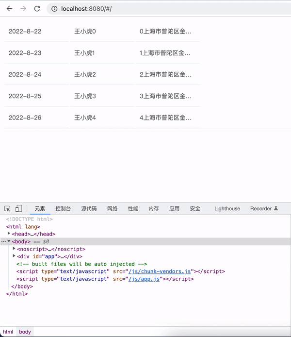
最终实现效果如下所示:
结论
- 整个
el-table内部只有一个el-tooltip组件实例对象,节省 DOM 节点的开销 - 每个
td标签都绑定mouseenter和mouseleave,当触发 mouseenter 事件时会回调 handleCellMouseEnter 方法,该方法会判断 td 元素的子元素是否包含el-tooltip这个类,以及内容是否超出显示区域,进而决定是否需要显示 tooltip 提示 - 当触发 mouseleave 事件时会回调 handleCellMouseLeave 隐藏 tooltip 提示
- 当
el-table-column设置show-overflow-tooltip为true时,会给元素绑定一个el-tooltip类,用于 handleCellMouseEnter 的判断
这不是对
el-table的整体实现的探索,只是针对 tooltip 提示这个小功能点的探索分析,毕竟这个只是el-table组件中整体功能的冰山一角,实际上el-table组件还是蛮庞大,功能较复杂的。